2009 - A Year in Review

Yeah, that's pretty much the shape of it. Here's hoping 2010 shapes up a little better.

The artist is IN! I am currently available for commission work of just about any variety (artistically speaking). Pencil drawings, ink, di...
Just for fun, here's a monochromatic portrait of Paul Chadwick's "Concrete". I've been reading some of these books lately and quite enjoyed them. As usual, I'm late to the party on this stuff, but it's quality is so far undiminished for the passage of time. Well worth a read, if you get the chance.
This piece takes a bit of artistic licence, as Concrete is not really an action figure kind of character. This
is just the way it flowed off my pen, and it was fun
to draw, and that's all I needed.

This is just because a Picasa user named Octobriana added me to her/his favorites and reminded me that I had done this one for Whitechapel way back. Besides, nothing says "Seasons Greetings" like a Wendy Williams clone in a leather bustier aiming pink dildos at a red sky. Happy New Year, internet.

Check out "Behold! Petrellica", the new website of up and coming comics writer Ben Zuerlein. At Ben's invitation, I am working on a story called "Madcap White Dancing" for submission to Kudzu Comics, an anthology put together by the Yoknapatawpha Art Council in Oxford, MS. Ben's written a nice short story that's just as reminiscent (to me) of Jaime Hernandez as it is of Neil Gaiman, and I'm really looking forward to digging into it.
I'll post some of the art from this story online as soon as it is available. In the meantime, why not check out Ben's site and see what he has to offer.
Tor.com is doing a Lovecraft theme this month, just in time for Xmas. I come by my love of Lovecraft by way of 70's Warren magazines, when Berni Wrightson blew my little mind with his adaptation of "Cool Air". Later, listening to OTR adaptations of "Dunwich Horror" and seeing John Carpenter's "In the Mouth of Madness" (not a Lovecraft tale as such, but as close as any movie ever got) cemented the relationship. Now I can gladly say I've read the entirety of Lovecraft's fiction, seen most of the movie adaptations, listened to (I think) nearly every radio show produced from his work, and consumed as many comics adaptations as I could get my hands on.
Best of all, I've been involved in some Lovecraft based work myself. My favorite to date has been Derek Pegritz's sadly discontinued online mythos novel "City of Pillars", for which I designed webpage banners and a set of postcards that have never been published.
As part of it's Lovecraft month, Tor invited readers to submit their own artistic interpretations in this thread,which I was more than happy to join. I've just added the image you see below, which is one of the aforementioned postcard designs. I've got to say, I'm very happy with the way this piece turned out. For more fun, go to the Tor thread and see all the other fantastic art that's being posted, both in the original post and in the comments.


I warned you I'd be doing this....


I posted this image here some time ago and promised to add a color version later, which took me forever to actually accomplish. Nevertheless, here it is, my own personal logo and avatar on many a web forum, "No Small Minds".


This is a piece I did just for fun.
One of the things that gets me through a typical workday is listening to podcasts, and one of my favorite podcasts is Keith and the Girl. It's funny, entertaining and occasionally even enlightening, and well worth a listen.
Recently, one of their listeners, Elvis, started getting KATG related tattoos and mentioned that he wanted to get a portrait of "the girl" aka Chemda. KATG called for listeners to send in their submissions for a Chemda portrait tattoo, and this was my contribution. I think I went a bit over the top with this, but once I started, I couldn't stop.

Here's another drawing to accompany a set of books that will be going up on Ebay this evening. I've never really been a fan of Valentino's "Shadowhawk"; the art didn't work for me, and I find the costume design impractical and difficult to draw, especially the helmet. Still, I like the way this one turned out.

Holy mackerel, I'm selling my comics!
I'm a comic junkie. Have been for as long as I can remember. There's no cure for it; the only hope is to control the disease.
I have thousands of the things; so many that they're threatening to overflow my studio space. So, I've decided to sell most of them, if I can. Like so many hopefuls before me, I've headed off to Ebay to see if I can generate some interest in my collection.
Click here to see all the auctions I currently have up.
I'm doing it a bit differently, though. Seems like it would probably take forever to sell the collection one book at a time. So, I'm selling in sets. Each set includes not only a good selection of comics from a particular series or publisher, but also other related items from my collection. I've got Previews catalogs going back over 15 years, promotional material from many publishers, related magazines like Comics Journal and Comics Scene, and much more, and all of this will be added to the sets of books as I find things that relate to the comics.
Here's the kicker: also included in each set will be a piece of original art done on a comic book backing board, featuring a character related to the books I'm auctioning. This is an opportunity to not only grab some good comics, but also to own a cool piece of original art featuring your favorite characters. (It's also a good opportunity for me to practice my quick sketching skills and play around with other people's characters.)
Sold so far is a set including the first 25 issues of Spawn, two Spawn miniseries and the issue of Wizard in which Spawn first appeared. I've got other sets up right now, and will be adding more as I put them together and finish the drawing.
Once again, go here to take a look at what's on auction.
Here's just a sample of the type of drawing I'll be including with the comic sets; this one is currently up for bids with the first few issued of Youngblood.

Let it be known that I have shorts, and once again they have been aired.
The drunkenly funny podcast "Air Out My Shorts" starring the inestimable Preston Buttons and the inimitable Word Whore have just read my fourth short story offering to them, "The Incalculable Mrs. McGonegal". It's a slightly skewed Mary Poppins-esque bit of fluff with which they have a lot of fun and pull off a decent reading.
Go to their site to listen or download the mp3 of the episode from this link.
While you're there, check out their other entertaining episodes and other paraphernalia at their site. It's been one of my favorite podcasts for a few years now, and your support will help convince them to keep going.
Here's the last of the Marshal Law drawings, and my favorite of the lot.
I'm a huge fan of Bernie Wrightson, especially his and Bruce Jones's story, "Freak Show". I think it ranks right up with "Frankenstein" as being his best illustrated story. Obviously, that story was very much on my mind as I did this illustration (one of the characters is actually based on Wrightson's "Jennifer" from another short story).
I like the idea of the Marshal Law having a backup cast of freakish characters to pal around with. I can imagine an interesting backstory for each of these.
On a side note, at least three of the characters in this drawing were based on people I knew at the time.

Here's two more of the Marshal Law posters I designed wayyyyy back in the 90's for the metal band of the same name in Newfoundland. Pretty basic stuff here, mostly focused on letter design (which always has been a weak point for me).
The backstory for this character involved him being a lawman who had been lynched by outlaws, then returned from hell as a Ghost Rider-ish character to dispense justice in a bloody fashion. Simple enough, but there's potential in there for any number of stories, and the concept was a good fit for the musical genre. I'm sure Iron Maiden may have taken issue with this had it gone far enough, but it really wasn't intended as a ripoff of Derek Riggs's work on Eddie. It's just that skulls and black leather are such iconic features of heavy metal music that it made sense to combine them in this way, and the name of the band suggested the form.
I've got one more piece to scan in this set. If you like these so far, the last one should really blow your socks off!


Here's another blast from the past. Back in the wild, free-rolling days of 1990, I was involved with the local music scene in St. John's, Newfoundland. I rented an apartment with a couple of local musicians and we spent a ridiculous amount of our time either attending shows at the clubs or just hanging out with other musicians. One of the benefits of this for me was that I occasionally got to do some design work for the bands.
Unfortunately, a lot of this work has been lost as I never bothered to keep copies of the posters I designed. However, this one project was a favorite of mine and I still have good copies of the work I produced.
Being a headbanger through and through, one of my favorite local bands at the time was a metal band named "Marshal Law" that did a mix of enjoyable cover tunes (from the likes of Metallica, Slayer and Megadeath) and their own, very good, original work. (This was, by the way, completely unrelated to either the English metal band by the same name, the American country band by the same name, or the comic book by Pat Mills and Kevin O'Neill.)
The band never really did go anywhere, but I thought they could have if they'd bothered. In fact, I was so taken with them, that I offered to do a series of drawings for their first CD. I designed a (admittedly Derek Riggs inspired) character for their band, including a backstory that I was prepared to develop into a full comic book if anyone was interested in going in that direction. Although the band liked the drawings, they broke up shortly afterwards and the work was never used. So, technically, this is the first time some of this is seeing the light of day (although I do recall seeing a shot of the character clearly taken from my design used as tattoo in Skin & Ink magazine).
Here are three of the ink drawings produced to pitch the character to the band. These were not really meant to be finished pieces, but rather to serve as the basis for paintings for the CD. I've got a few more that I'll post another time as they're scanned. Enjoy!


Who ever said that Objectivism doesn't have a sense of humour? To put the lie to that, Ian McDonald offers a birthday card I made for him several years ago.
Click here to read about "The Philosophy That Made a Man Out of MacDonald".
My good friend and sometime collaborator Ian McDonald is running a series of his old drawings over at Bruno the Bandit this week, and it's kind of inspired me to look back into my own archives once again and pull out a few pieces that I've never really shared.
One of my favorite older pieces is this portrait of my character DeathMask (previously seen here). This is one of my graphic novel projects that's still in limbo, mainly because it got roundly rejected by the publishers to whom it was sent, and that really put me off my feed on this one. Still, I think the idea behind it is solid and might just have to blow the dust off it one of these days. Meantime, there's images like this one to remind me of what it could have been. By the way, this was colored the old fashioned way, using watercolors, back before I got into digital coloring.

Naturally, the internet is abuzz today with the news that Disney has purchased Marvel (I'd take the time to look up a link for you, but just try to move on the net without tripping over one). Also naturally, I'm hearing rumblings from Marvel fans that they're worried their favorite comics will become "Disney-fied" - clean, wholesome and otherwise unenjoyable. One of the popular visual memes that's coming about as a result of this is the Marvel/Mickey mashup, with various Marvel characters heads shopped onto Mickey's body.
It's cute, but it got me thinking, what if it goes the other way....what if Disney instead becomes "Marvel-fied"? One look at this thread of comments at Warren Ellis's site shows the possibilities should Mickey and friends fall into the wrong (right) hands. Heck, look what happened when Marvel met up with Archie Comics.
So, thinking along those lines led to this, my contribution to the Mickey/Marvel mashup meme (now with bonus alliteration!). Click to see full size. Enjoy.

Here's a Green Lantern portrait I did for this thread over at The Drawing Board forums. I'm mostly pleased with the final result on this digital painting, although I can see a couple of areas that could use some work. Since it's just for fun, I'm not too worried about it.
Found today at Warren Ellis's column "Do Anything" over at Rich Johnson site "Bleeding Cool", reposed here entirely without as much as a "by your leave" because I think it's bloody brilliant and perfectly states any number of things I think, including the reason I enjoy reading the work of insane Brits:
“There’s That Goddamn Sun Again”
Another day down the mines of our lives. We drink ’til we stink and smoke ’til we choke because that’s how we get things done, you and me. Spending our lives making things and making things out of our lives, because anything else would be dull as hell and we’re damned if we’re going to sit at the other end of whatever years we get saying, well, what the fuck was that for?
Years of scars, lipstick and tears, and every day the dawn comes on we turn our eyes up in surprise, saying, “There’s that goddamn sun again.”
© Warren Ellis 2006
My comp copies of Nate Kenyon's "Prime" arrived in my mail yesterday, and I feel like sharing, so it's time for another contest.
For those who don't remember, "Prime" is the novel from Apex Books for which I did the interior illustrations. It's a science fiction murder mystery reminiscent of work by William Gibson, Philip K. Dick or Neal Stephenson, and it's an enjoyable read by any standard.
The copy I have to give away is trade paperback sized and signed by the author (and if you like, I can sign it for you as well). To enter to win it, you just have to email me (see the link to the left) or leave a comment with your email address to be entered in a random draw. The deadline for the contest is next Friday, 14th August at midnight Atlantic Time.
Jump in with an entry, and you might win yourself a nice signed collectible. Of course, if you can't wait, you could alway head over to the book's page on Apex and order a copy for yourself.
The latest issue of Apex magazine, vol. 3, no. 2, is now available through the Apex store. What makes this one so special?
Well, they're all special, just because they contain some great fiction and editorials. However, the latest one also has a full color half page ad for this site. This is the first time I've taken out advertising in print for my art. Apex made the rate so reasonable that there was no way I could turn it down. As a bonus, I also get a month of rotating ad banner space on the Apex site, so it's good all ways around.
Apex magazine is available in epub and pdf formats through DriveThru Stuff, in Kindle format via Amazon, and in a print on demand version. You can also get previews of the content at the Apex Book Company site. I've purchased the print version of issue 1, and let me tell you, it is slick. Good paper stock and a nice crisp cover image. Well worth the cover price.
Astute readers will notice some changes to the blog in the last day. Besides tinkering around with my template, I wanted to highlight a few sections of the blog that are or will become more important. Mainly:
-Portfolio. Obvious, really. I want to provide a quick link to my best work for prospective clients.
-Tools. I plan on doing some writing on tools I use when creating.
-Reviews. In the past, I've been asked to do reviews, and wouldn't mind doing some more of them. If you're a content producer or distributor (e.g. books, films, software, luxury ermine lined sport socks, what have you) looking for an honest (key word: Honest!) review, hit me up with a sample or a link to download your product, and I'll review it here in my own funky fresh style.
-Contact. Also obvious.
If you are a constant reader and find that my tinkering has caused all or any part of this blog to break for you, please be a dear and drop me a line to let me know.
Just for a chance of pace this week, I decided to try one of the drawing jams over the The Drawing Board. The jam of the month is to do an interpretation of photo reference of gamer girl Olivia Munn. Not being a hardcore gamer, I've never heard of her, but when I saw the photographs, it just screamed out for a Coop style interpretation, so here's the result (SFW, depending on how strict your workplace may be)....
Sometimes...not often, fortunately...I'll fire off a piece of work and forget to follow up on it. That was the case with this one, which I sent to the publisher over a year ago, and only remembered yesterday when I was browsing through a disc of older projects.
This is a pinup page that was done for issue #3 of the comic "Pencilneck" from Paperstreet Comics, a very well done comic by Vic Carungi, Jeff Blascyk and Antonio Brandao. It's the story of a mild-mannered banker who finally gets pushed too far, giving us a look at just what people are capable of under the right (or in this case, wrong) conditions.
Not only did the page make it to issue 3, but they've also seen fit to include in their trade paperback collection of the story. If you're interested in reading it (and I do recommend it...my own copy's on the way right now), the individual issues as well as the trade paperback...along with Paperstreet's other comics...are available from their estore. 
Another week, another post at Whitechapel. I'm still enjoying the hell out of this every week, but I'm starting to think that it's eating into productive time, and I may have to leave it alone for a while. At least until I get a couple of personal projects done.
Meantime, here's the latest Remake/Remodel, "Atomic Man". From the character description:
"Adam Mann is conducting experiments with the radioactive isotope Uranium-235, and is caught in a "weird chemical accident" giving him atomic powers. He uses these powers to covertly fight crime and Communism as Atomic Man. His powers include super strength, flight, and projecting energy blasts from his right hand. To control and neutralize his power, he wears a lead glove over his hand and takes it off when he wants to turn the powers on. "
I was inspired by the covers of some recent Marvel comics for this one, especially covers by artists like David Finch and Richard Isanove. I think this one turned out particularly well. Comments or criticisms?
 Click the image to get a full view in glorious color.
I'm pleased to announce that the winner of the draw for the free copy of Paul Jessup's "Open Your Eyes" from Apex Books is Angelia Sparrow.
Angelia was kind enough to link back to me from "The Den of Debauchery's Garden Gazebo" (now there's a blog title for ya!) and will be receiving a copy of the book by snail mail just as fast as the U.S. Postal Service can deliver it.
Thanks to Angelia and to all who entered, and be sure to check back for more contests in the (near?) future.
Meantime, if you just can't wait to get your own hands on a copy of "Open Your Eyes", it's available from the Apex Books store, and according to their blog today, is one of their top sellers for June. I've started reading it myself, and while I'm not a fan of this kind of high concept sci-fi, I find this book quite accessible and well written. Fans of "Solaris" and Danny Boyle's "Sunshine" should love this one.
Get your copy while it's hot!
Apex Books has kindly sent me a couple of complimentary paperback copies of Paul Jessup's latest book, "Open Your Eyes", described as "a surrealist space opera of haunting beauty and infinite darkness." I've just started reading it, and while some of this high concept stuff tends to turn me off, I'm finding this one very accessible so far.
To give readers a chance to sample Paul Jessup's work and to check out the kind of offerings available from Apex, I'm putting up a copy of this book as a contest prize through this blog.
But you don't get it for nothing...no, no, far from it. In order to qualify, you've got to give me some link love. Here's how it works:
As promised in my last post, here's a color version of that image from Nate Kenyon's "Prime". The color scheme was very much inspired by B-movies and sci-fi/horror comics of the 50's. I wanted it to look really garish to get across the power of the scene. The illustrations in the book are in black and white, so this one was done just for my own, and hopefully your, enjoyment.
July 1st marks more than Canada Day this year. It also marks the release of "Prime", the new book by Stoker award nominated author Nate Kenyon. What makes this a landmark day for me is the fact that "Prime" is illustrated by none other than yours truly.
This short novel contains four black and white illustrations produced specially for this first edition from Apex (Note: The cover's not mine, but rather the work of the clearly talented Katja Faith). I'm not just blowing smoke when I say I had a great time creating them; this book was as enjoyable to read as it was to illustrate, and that always helps fire the imagination.
"Prime" is a dark science fiction story with ideas that recall some of the better urban science fiction novels, such as Philip K. Dick's "Do Androids Dream of Electric Sheep", William Gibson's cyberpunk novels, and Neal Stephenson's "Snowcrash". It's a futuristic murder mystery that skilfully avoids most of the cliches of other genre-crossing detective fiction to take an insightful look at where our use of technology may be headed and consider some of the unexpected consequences that may be the result. It is satisfying both in terms of entertainment and intelligence and although it is a relatively quick read, it is definitely time well spent.
As for the quality of the illustrations, I'll let you judge for yourself. Below is one of the four pages produced for this book. (Quick side note: I had originally intended to upload a color version of this page, but either Windows Vista or The Gimp lost its mind while I was saving, and dumped all of my color work. I'll update with a color version as soon as I can). Be sure to check out "Prime" at Apex Books website. It's available to order now for $13.95 US, and even if you're not a fan of my work, I think you'll find that it will be money well spent.
This week, LiveJournal user Phil McAndrew is running a contest based around the idea of drawing yourself as you think you'll be at age 100. My own entry is below.
In short, I see myself as somewhere between Sid James and Yoda. I figure once I hit 65 all bets are off, and an orgy of hedonism unknown since the reign of Caligula will commence. Of course, it will help that I'll be rich beyond the dreams of avarice by that point, and will be able to afford a steady supply of Jack Daniels whiskey, imported cigars and Vargas girls in nurse costumes with butts just a made for slappin'.
Please note the artificial leg; I figure I'll have at least one limb replaced by a plastic polymer prosthetic (say THAT fast five times!), probably manufactured by Apple. Also note the wetwired earbud implants, inspired by Lobo, which will deliver a constant feed of Tom Waits and Danzig directly into my cerebellum...just for mood.
Also, in the future, everyone will be required to wear fuzzy Cthulhu slippers.
Yes, I know that background is crappy. I dithered over it for about an hour before finally going with what I call the "Bloom County" solution...."Just wing that mother!"
Here's the latest from the Whitechapel Remake/Remodel thread, this time a spin on the Arthur K. Barnes character Gerry Carylyle. The thing I love most about posting to these weekly threads is that I get to play around with a variety of styles and try out new techniques. I make it a point to make each week's submission an experiment with a different yet recognizable style.
In this case, I wanted to do something in the vein of the modern crop of kids' comics like "Alison Dare" or "Amelia Rules". In past weeks, I have done mockups of Cartoon Network DVD's, 70's mystery novels, 40's pulp novels, and recently, an homage to Moore and Gebbie's "Lost Girls".
I find that it really helps spark the creative fire to take a chance on something artistically and not have to worry about the consequences if it doesn't work out. It really brings back the fun that often gets lost in concerns of deadlines and client demands. Sometimes my postings get positive responses from the other forum members (a talented bunch; praise from them is high praise indeed), sometimes they get no comment at all. Either way, the best reward for me is the moment when the piece is complete and somewhere close to what I pictured when I started out. I know then that I've learned something valuable and had fun along the way.
Over at Apex Book Company, they're running a piece of cover art I designed for them...well, sort of. They're giving me full credit for the cover of the ebook version of "Last Dragon" by J.M. McDermott, but only about half of the work is mine. I just did a little redesign work on the ants and added the title and author credit. Nevertheless, I'll take what I can get.
I haven't read "Last Dragon" yet, but it's getting good reviews from around the web, including being picked for the Editor's Top Ten Science/Fantasy Picks of 2008 at Amazon. When you consider the number of fantasy books cluttering the field right now, that's high praise indeed, so you can guarantee this one will be going on my reading list.
If well-written fantasy is your cup of tea, why not drop by the book's page at Apex and check it out; it's going to be available in the coming week for the Kindle and at Fictionwise, and I'm sure it will be well worth the price.
It's always fun when this happens....first it was Keith and the Girl, this time it's "Nobody Likes Onions". In the latest episode (episode 423), about 30 minutes in, Patrick and and Johnny B. really take me to task for some comments I made on their forums. Well done, lads.
WARNING: NLO is very politically incorrect, but if you can put on a thick skin for a while, it's usually good for a laugh.
I've been interviewed! Bill Taylor of the resourceful and entertaining blog, "The Tools Artists Use" has posted some of my work along with an interview about my tools and methods. It's online now and can be read here.
This is one of my new favorite blogs, and I would have said the same even before he ran this post. It's great learning about the tools and techniques of other artists, even...heck, especially...if they're widely different from me in terms of style. I also enjoy reading the language they use to describe themselves and their work. This is the kind of insight you can't get in a regular art class or from a book on technique. Be sure to check out "The Tools Artists Use" from time to time and see what's new and interesting.
Another week, another Whitechapel post. I've really got to do some other projects; I'm starting to feel like I'm going to this well too often. It's just that the weekly Remake/Remodels are too damn fun to resist.
The latest Remake/Remodel over at Whitechapel is a golden age criminal character called "The Octopus", which led to this Necroscope-inspired piece of work....
For anyone who's curious, "Nemo Woodbine" is a name that Warren Ellis once proposed as an "Allan Smithee" of the comics world...an alias to be used by anyone who did not want to or could not sign their real name to a piece of work.
In case you haven't noticed it in the sidebar, Apex Books is offering a free pdf download of Paul Jessup's "Open Your Eyes". Described by Jay Lake as "surrealistic space opera in the tradition of New Wave experimentalism", "Open Your Eyes" is a novella that promises to be entertaining and possibly consciousness-expanding. I haven't read it myself yet, but if it's on par with the quality of the other offerings from Apex that I've enjoyed in the past year, it will be worth a look. And you can't beat the price.
If you're looking for a free read for the weekend, why not head over to Apex grab a copy, and while you're there, check out the other great offerings in their store.
I'm back from vacation, tanned and touristed out, not much the worse for wear after braving the wilds of Orlando. Florida was not as crazy as I expected. Not as crazy as, for example, a fish with titties.
That's a phrase I've heard bandied about by Patrice, my favorite regular guest on the Keith and the Girl podcast. Apparently, it comes from some rap lyrics by R. Kelly. I thought it made for an interesting visual, so I did this little piece that I sent to Patrice in full fanboy mode. Ladies and gentlemen, for your viewing pleasure, I now present...the Tittyfish. You may now be amused.
I've been having loads of fun over at Warren Ellis's Whitechapel forums these past few weeks, what with the weekly Remake/Remodel of golden age characters going on. Here's a few samples of what I've been up to (all descriptions come from Jess Nevins by way of Whitechapel):
Ivan Brodsky was created by “Victor Rousseau,” the pseudonym of Victor Rousseau Emmanuel (Jim Anthony, Clifford, Ronald Gowan, Professor MacBeard, Dr. Martinus, Pennell, Shawm, Thorne), and appeared in eleven stories in Weird Tales in 1926 and 1927, beginning with “The Case of the Jailer’s Daughter” (Weird Tales, Sept. 1926).
Ivan Brodsky is a Big-Headed Dwarf Genius Occult Detective.
Ivan Brodsky, the “Surgeon of Souls,” works as a “professor of nervous diseases” at a London hospital. He is a “dark, sinewy, undersized man, with a great head absurdly disproportionate to his body, and flashing eyes that seemed to pierce through you and read your thoughts.” He is “a cross between two races whose blend of shrewdness and mysticism was probably accountable for the production of so remarkable a personality as his own.” He is unassuming and doesn’t socialize, but is “all-dominating” in his hospital, where he performs experiments for treating “obscure brain lesions.” He is an expert hypnotist who receives cases from around the country. His particular cases involve psychic matters of reincarnation and possession, and he believes in an “oversoul” to which individual souls return, so that the execution of a brutal murderer will “be the release of just so much additional force of evil” to the oversoul.
Moris Klaw was created by Sax Rohmer (better known as the creator of Fu Manchu) and appeared in a series of stories in 1915 in the All-Story Cavalier Weekly and which were later collected in The Dream Detective (1920). Klaw is something of an occult detective, ala Dr. Silence and Carnacki, but most of his cases dealt more in psychic than in overtly magical phenomena. Klaw is a tall man, stooped and gaunt with age, usually wearing threadbare clothing and looking unkempt. He lives in a poor part of London, not far from Wapping Old Stairs, in a "decayed curio shop" of most unpleasant seeming. It is also inhabited by a parrot, which shrieks "Moris Klaw, Moris Klaw, the Devil's come for you" when someone enters the store. Klaw is an antiquarian, full of oddball information, but his true advantage, and the thing that is of most use to the police (who are welcoming of his help), is his clairvoyance, which is heightened when he sleeps. It is not uncommon for Klaw to sleep at a crime scene. When asleep, he is more receptive to psychic impressions; when he sleeps, Klaw takes in all sorts of information, and uses it to explain things to both the other characters and the readers. Klaw is full of self-regard, and his speech of is full of self-satisfaction and affectations.
Klaw is helped by three other characters. Searles, the narrator… Detective-Inspector Grimsby of New Scotland Yard works as Klaw’s contact with the police. And Isis, Klaw’s daughter, lithe, dark, and mysterious, aids him; she is the one with access to Klaw’s notebooks, and her French accent and smoking of cigarettes indicates what other aid she might be able to give in the service of Klaw.
The Bat was created by Eden Phillpots, under his pseudonym of "Harrington Next," and appeared in Number 87 (1922). The Bat is Paul Strossmeyer, a Yugoslav trade representative who grows concerned with the short-sightedness of various world politicians, especially with regards to the discovery and application of atomic energy. So Strossmeyer begins a series of terrorist acts, from the disintegration of the Albert Memorial to the destruction of various Christian Science churches to the assassination of several politicians, from Britain, Japan, America, and Russia. In each case the assassination was done by a needle-thin puncture near the heart and the transmutation of various elements of the body. Also in each case, a mysterious figure was seen near the crime; this figure, the Bat, is larger than a man, has glowing eyes, and leaves behind a foul stench.
Strossmeyer is the Bat, who worked with radioactivity for decades and discovered Element 87, which allows for the easy splitting of the atom and the production of enormous amounts of energy. Strossmeyer used Element 87 to power his flying suit, his weapons, and his bat-shaped aircraft, which can fly through the upper atmosphere at 100,000 miles an hour.
It all ends badly for Strossmeyer, of course, who destroys his fortress and then heads off into space to kill himself.  I'll probably be doing one of these each week until Warren gets tired of hosting the darned thing, and I'll post the occasional collection of the best here. Now I'm off to work on that Captain Justice vs. Irma Vep remake....
 Over at Amazon, I've just finished reviewing the latest good read from Apex Publishing, R. Thomnas Riley's "The Monster Within Idea". I won't repeat it all here, but here's a quick taste:
"This is an excellent exploration of the short story form. Riley is very adept at creating an engaging setting or situation in as few words as possible, then playing out tense, gripping scenes within those worlds. In this fine collection of stories, ranging in length from 2 to 30 pages, he crafts bold, and often bloody, dramas in which the players are driven as much by the demons that live inside as much as by those that lurk outside. The results are variously entertaining, thought provoking, and chilling. "
If you'd like to know more, go on over to the book's Amazon page and check it out. If you like it, you can order the book there, or directly from the Apex store, or in ebook format at Fictionwise.

It looks like I'm going to be in on the sketchbook phase of the 100 Artist Project after all, which is good news to me. I've already sent in my submission for the mailer portion of the project, and I'm looking forward to contributing to the second phase.
For anyone who's not familiar with it, the 100 Artist Project is "a charity endeavor created to help raise money for artistic and creative organizations." Original pieces of art are created to compile a books that are sold to benefit charity foundations such as The Hero Initiative and Comic Book Legal Defense Fund. I'm pleased to have been a part of the first book, which is now available for sale at IndyPlanet, and I've just gotten word that I'll be included on the mailing list for the sketchbook for the second volume.
The project is still looking for people, so if you're an artist interested in supporting their cause, or would just like a little bit of good exposure, why not go over to their site and sign up? Or, if you're a webmaster or blogger, how about grabbing one of their banners (like the nifty one above) and flying it on your site? I'm sure they'll appreciate any help they can get.
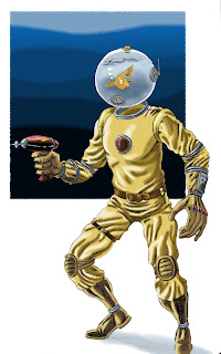
Just a little something done to have a go at scanning and coloring pencil work. Any comments on quality, or suggestions for improvement are welcomed.
Also, done because I really felt like drawing a guy with a goldfish bowl for a head. Some days, you gotta go where the muse takes you, ya know?
Like most sentient beings on this side of the world, I'm looking forward to seeing "The Watchmen" this weekend. This is sort of a holy grail of comic book movies, so regardless of Alan Moore's opinion of adapting his works, there's no way I can miss this.
In preparation for seeing the movie, I'm rereading the graphic novel (and if you haven't done so, you absolutely owe it to yourself to do so as well, even if you're not a comic book geek like me).
Being a little older than the typical comic geek (somewhere more than a decade and less than an epoch), I remember reading the adventures of the original Charlton heroes on which the Watchmen were based. The Peacemaker, Thunderbolt, Blue Beetle, The Question (not so much Phantom Lady; she didn't get much play at Charlton), and their missing contemporaries Dr. Graves and E-Man, were part of my earliest comic reading experience.
So when I read Watchmen, I can't help but wonder how different the book might have been had it been done using those Charlton heroes as Alan Moore originally intended. That, of course, leads me to ponder an alternate reality in which it is those characters, instead of their revamped versions, that made it to the big screen.
So here is the result of several wasted lunch hours pondering the question, "What if the Charlton heroes were used in the movie version of the Watchmen?"
I recommend clicking to get the full view on this one, BTW.

It's all over my news sources this morning that SF author Philip Jose Farmer passed away yesterday. At 91 years old, it's not exactly a tragedy, except in the sense that humanity hasn't discovered a way of making its better representatives immortal yet, but nevertheless his passing should be noted. In a perfect universe, he'd be on a riverboat with Sir Richard Burton and Tom Mix right now.
Farmer was one of my first and strongest science fiction influences. He, along with Robert
Heinlein, was responsible for blasting open the doors of my developing teenaged mind. "Image of the Beast" remains a very conflicting novel for me, more than 20 years after first reading it, while "Riders of the Purple Wage" was an early philosophical influence. His work on Doc Caliban and the other icons of the pulp age was a clear inspiration to many of my favorite writers and my own writing as well.
Farmer was one of those eclectic writers, like Harlan Ellison or Stephen King, who was capable of going in any direction with his work, often delighting and surprising with an unexpected change of course. From hard SF to eroticism to pulp fiction to dead-on humour, his fiction was always rewarding to read.
If you've never read any of Farmer's work, it's worth your while to seek some out. If you'd like to start out with something on the cheap, why not try the heavily Edgar Rice Burroughs influenced "Green Odyssey" audiobook available for free over at Librivox.
Sail on, sail on, Philip Jose Farmer.
An image from one of my recent projects has recently gone online. Late last year, I completed a set of image for an upcoming CD from the band "Sky Club". The album is called "Ipodius" and it's due to be released later this year from Umbrello Records. You can find out more information about the CD on its Umbrello page. Here's the cover:
This is obviously only a thumbnail of the image; you can see a larger version at Umbrello.
One of the cool things about this CD is that one of the musicians is science fiction author Mack Maloney, creator of the Wingman, Starhawks and Superhawks series of novels. Besides being an entertaining author, Mack's quite an accomplished keyboardist, judging by the samples I've heard from this band.
If you're a fan of good progressive rock (of which I don't think there's enough any more), then take it from me that this will be an album well worth listening to. I'll update here as soon as I know that the album's available, and will try to get permission to post another image or two from the insert. Inn the meantime, keep an eye on their Umbrello page for more news and information about the CD, and while you're at it, check out some of Mack's books for some good reading.
Quick update:
The album is still a go, but it has switched distributors, and there has been a title change, so I've removed the link and the original cover thumbnail. I will create a new post with new information soon.
Not to be outdone by their male counterparts, here are three ladies of classic horror. Once again, if you have to ask who they are, shame on you. Turn off "Saw the Umpteenth" and go watch some horror with class.


Some rough sketches for a piece I'm contemplating; all are based on old publicity stills. If you have to ask who these gentlemen are, then you probably don't need to know.


