Images From Around this Blog!

Featured Post

Available for Commissions!

The artist is IN! I am currently available for commission work of just about any variety (artistically speaking).  Pencil drawings, ink, di...

Showing posts with label portfolio. Show all posts

17 August 2016

Painting Process - Brain Dead's Disaster Ahead

Hot off the drawing board is the latest album cover for L.A. thrash band Brain Dead.  Once again, I get the pleasure of illustrating the adventures of Billy Brains for these guys.  This one marks my fourth outing for their music, having done the label for their EP and the covers for Indoctrinator and their team-up with Six Pack of Doom.
Having rediscovered a taste for working in physical media lately, I wanted to do this one as a full-on painting, with as little computer work as possible.  I thought it might be interesting to post some of my process for this piece, so I tried to remember to photograph the piece at each stage of progress.  Click any of the images to see them at a larger size.

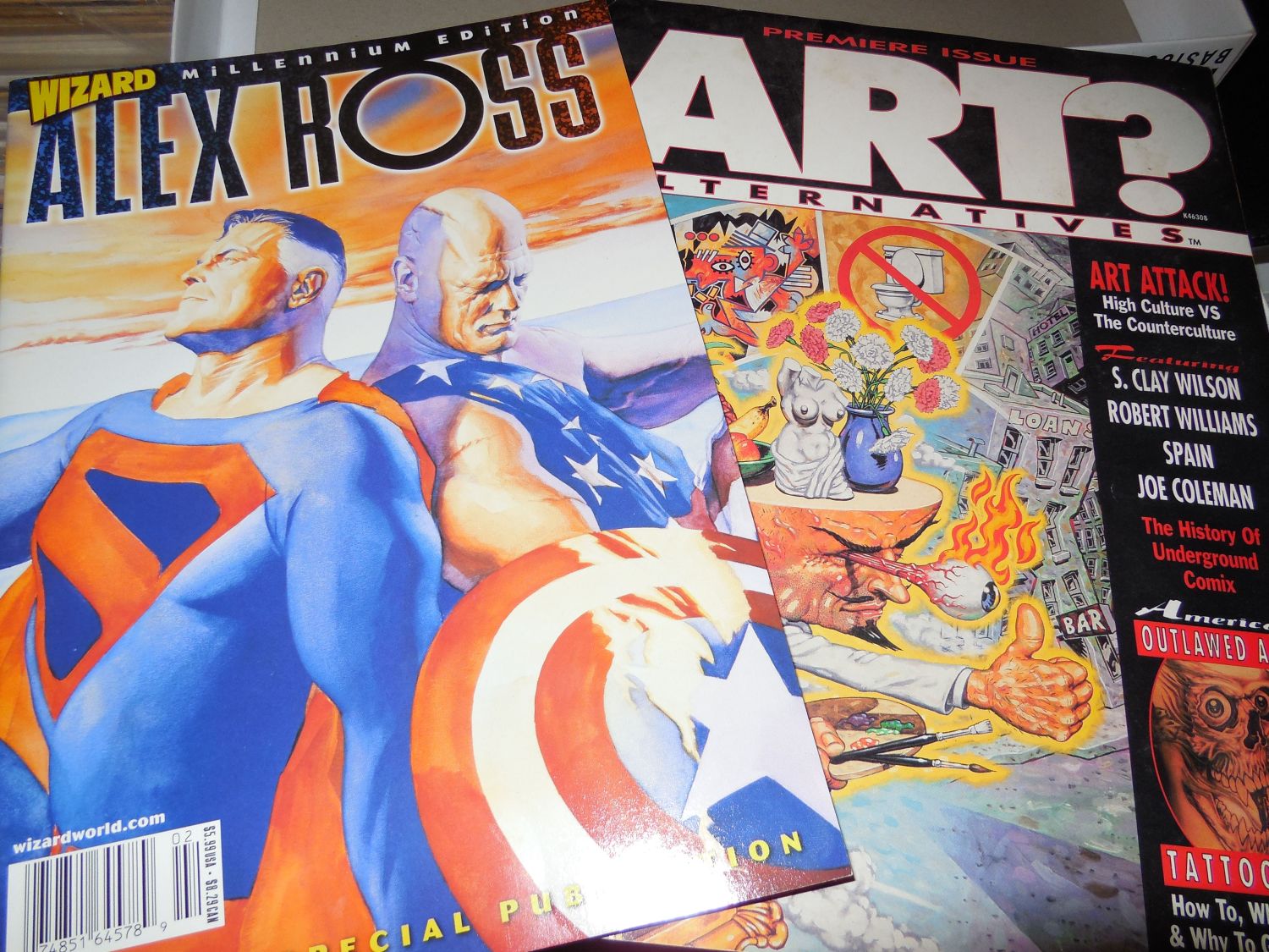
Seen below are the major inspirations for the painting, Alex Ross and Robert Williams.  I turned to Ross for technique, as he's one of the few artists I know who's not afraid to work with straight black, and because I wanted to experiment with his style of underpainting.  William, meanwhile, informed my sense of design and color choice.  Although they may seem like an odd pairing, when I got into it, I discovered they were more alike than you'd at first realize.  This is probably due to both having their roots firmly in the comic industry and bringing that perspective to their work.


The band sent me a fairly detailed description of what they wanted to see in this piece.  It was just up to me to tweak the design a bit, then execute it with detailed touches of my own.  My first step was actually to gather some photo reference for the piece and paste together a sort of digital collage, tweaking the elements until I got the composition I was looking for.

Working in Sketchbook Pro on my tablet PC, I turned that collage into a "pencil" drawing where I laid in some of the details I wanted to see in the finished piece.  This was roughed in color in Photoshop and sent to the band for approval and/or corrections.  There was only one critique to come from this; I had originally placed logos of other bands as stickers on the dashboard, intending them as a tribute to some of Brain Dead's musical influences.  They decided they didn't want them there, which makes sense in retrospect, as that might cause legal issues.  So even though I thought it would be a cool tribute, I removed them and later replaced them with parodied versions of L.A. area radio station logos.


Once the composition was nailed down, I chose my work surface for the finished painting.  A nice big (20 x 30") piece of cold press illustration board did the job.  It had a bit more tooth than I like on my boards, so I applied about half a dozen coats of gesso, with sanding in between.  When that was done, I had a nice bright, white, smooth surface on which to paint.  I blew up the color rough to size and had it printed in 11 x 17 sections that were taped together to make a full-sized print.  With this and a 6B pencil, the drawing was transferred to the board.

After each session at the drawing board, I will stand back for a few minutes and just study the piece to make sure I like the way it's working out.  After transferring the drawing, I decided that the composition seemed a little too stiff for my liking.  The solution was to change Billy's pose to something more dynamic.  I think this gave more energy and interest to the piece, while still maintaining the balance of the composition.


Once I was satisfied with the drawing once again, I started in on the underpainting.  This was done in two passes, one to just pick out the forms in black, with no concerns for shading at this point.


The second pass added grey tones that I hoped would show through in the final painting.  Alex Ross uses gouache for his color work, which is naturally more transparent, but I find that if I thin my acrylics enough and work quickly enough, I can achieve a satisfactory level of transparency as well.


Now I'm ready to start blocking in the color, starting with the background.  I'm pretty sloppy at this stage, as I'm not concerned about colors overlapping too much until I get into the detail work.  I've learned from studying the work of artists like Boris Vallejo that it can be a benefit to have some mingling of color to create subtlety in the finished work.

From that point, it's just a matter of laying down the color in several layers, working from "back to front" for the details.  The big challenge for me was to render the borealis behind Billy on the right, as this was something I had never attempted before.  I had actually rendered this in a completely different way before deciding I didn't like the results and painting over the whole area and starting again.


More detail work.  You can see that the thing is finally starting to come together.  Note the bands of black at both sides of the painting.  As this is for a CD cover, the painting had to be square, which meant that I had leftover space at each side of my board.  I coated these areas in black and tested out my borealis technique on them.  This leads to an interesting result later on.


Nearly there.  All the major colors are in place and most of the details picked out.  Here, I'm trying to work out things like light and shadow, plus tiny details like the photo CD's in the visors, and the faux radio station logos on the dashboard.


And done.  There's a few tweaks left to do once I have this thing scanned, but otherwise, it's complete.  There's still a few things I'm not entirely happy with, but I learned long ago that I'll never be completely happy with any piece of work, and there comes a time when you just have to put down the paintbrush and call it a day.  If I give in to the temptation to continue tweaking a piece, it will end up overworked and possibly just a big brown/grey mess.

You can also see now what I ended up doing with the empty space off to the sides.  I thought it would be fun to do quick, impressionist portraits of the band members (plus Billy!) from photos on their Facebook profiles.  These were executed in about 5 minutes each, using a square brush loaded with titanium white, with a bit of black to pull out some details.  I'm not much of a portraitist, but this was a quick bit of fun.

A closer look at the band portraits.


And, finally, the finished piece with all the digital work done and the band logo dropped in.  This is, more or less, how it will appear on the CD cover.  The sharp-eyed fans on Facebook seem to have been having fun picking out all the details and metal music references worked into the painting.  I won't spoil the fun by listing them all here, but there are quite a few in there.

This is one of the most fun pieces I've done in years, partly because of the subject matter, and partly because I really enjoyed getting back into acrylics to this depth.  It helps too that I actually enjoy Brain Dead's music (Indoctrinator was my soundtrack more than once while painting this) and the guys are great to work with.
While you're here (you are still here, right?) let me suggest you check out Brain Dead's music over at Bandcamp and on Facebook.  If you like your music on the heavy side, this will definitely please you.  These guys really bring the goods.  Watch for the new album, "Disaster Ahead" to drop there soon.


06 March 2014

New Work Published: Making the Cut

Out right this very minute is "Making the Cut", the latest collection of tales from publisher Mike Davis, editor of Lovecraft EZine.  This collection features nine stories from the magazine given "Honorable Mention" by Ellen Datlow in "The Best Horror of the Year Volume 5", so you know it's going to be good. 

The cover, a brilliant bit of design by Leslie Harker, features an original piece of art I created to this volume.  This piece was inspired by the W.H. Pugmire story contained in this book, and was my first finished piece done entirely in Corel Painter. 

Be sure and check it out.  I'd love to hear what anyone thinks of the cover, and I'm sure Mike Davis would love to hear your opinion of the book.


10 January 2014

New Work Published: Believable Illusions

At the time of writing, it's the end of the first full week of January, so to all my visitors, Happy New Year!  I'm kicking this one off with a fun little project I hope you'll enjoy.

I sort of did a soft launch on this one just before Xmas, but that was mainly so I could print some copies for vanity press purposes.  Plus, I didn't want to jump all over the attention that belonged to "Bruno the Bandit A Card Game".  Now, though, it's time to introduce you to my latest book, "Believable Illusions".  This is a portfolio of some of my best work to date, including a lot of work I've published both online and off, as well as some pieces that have never seen print before. 
With separate sections for Color, Black & White, Comics, Character Design and a special section of work used for the Whitechapel forums, all of which is annotated with my commentary.  It's a book that's literally been years in the making.  The best thing is, it's still a work in progress!  I plan to update this from time to time with new work as it becomes available, at least until I consider this collection "finished".
Until I put this volume together, I didn't realize how many places I'd been published in the last few years.  From my early color work on Bruno the Bandit to the most recent illustrations for thrash metal group Brain Dead, with a lot of interesting stops in between, it's been a fantastic ride that shows no signs of stopping!


"Believable Illusions" is only available through DriveThruComics.com.  What's really great about that is that thanks to DriveThru's new print on demand service, you can get this book in a glorious, full-color hardcover as well as in digital form.  In fact, if you buy the hardcover, you get the pdf version for free!  The hardcover is a meagre 10 bucks, while the pdf version is only $1.99.

If you like my work, and would like an affordable way to help me keep doing it, this would be a great way to show your support.  Plus, I think I've put enough pretty pictures in there that even if you just want some eye candy this ought to make a good addition to your library.

Check it out, and see what goes into making "Believable Illusions".

Update 01/15/14:  Oops...just realized I hadn't made the hardcover active for sale.  Fixed now.  Buy it in droves, you will.

16 December 2013

New Work Published: Indoctrinator by Brain Dead!

One of the things that made me want to get into the art business in the first place was the art on '80's rock albums.  Richard Corben blew my doors off with his cover for Meat Loaf's "Bat Out of Hell", and Derek Riggs made sure they stayed blown off with his art for the various Iron Maiden albums.  Ever since, I've been fascinated by the art and design of album covers, especially for the heavier styles of music, as they seem to have more fantastic elements.
I still have, somewhere in my sketch archives, a few of the pencil reproductions I've done of some of Derek Riggs's work,, as well as variations of pieces of art I've done for local bands like Urgent, Innocence and Marshal Law.  Somewhere in there, there's also a few pages for a very early comic book called "Warriors of the Metal World" that did fantasy/horror comic adaptations of heavy metal songs.  The less said about that the better.
All that is but preamble to tell you why I'm so proud to be part of this current project.  A while back, the thrash band "Brain Dead" invited me to design a piece of art for their demo CD and T-shirts.  This led to me designing their mascot, "Billy Brains" (no Iron Maiden influence there...nope, no sir), and later to the current project, the cover for their debut album "Indoctrinator".
I've been keeping the full version of this under wraps until the band was ready to release it themselves.  Now, as of midnight last night, they've released the art along with the first track from the album, "High Value Target".  The track, indeed the entire album was funded through a Kickstarter project to bring producer Bill Metoyer on board.  If you'll take a look at Bill's website, you'll see that his credentials read like a who's who of heavy metal.  With those kind of productions values and talent like Brain Dead's at the wheel, you know that "Indoctrinator" is going to one wild ride!
You can hear "High Value Target" right now over at ReverbNation.  Crank those speakers up and rock out with some of the best new metal tearing up the net.  And while you're there, be sure to check out the eye candy on that cover.
Thanks to Adam and Rez and all the rest of Brain Dead for inviting me to be part of this project, and I hope (wink wink) we get the chance to work together again.


Update:  The full album "Indoctrinator" has now been released.  You can find it at their BandCamp page or search it on iTunes.  Go get it now!

03 October 2013

New Work Published - Defeat Your Beast

Here's one I'm rather proud of for different reasons than usual.  Not that it's necessarily my greatest work, artistically.  In fact, the art I contributed is rather basic.  I'm proud of this project for its intent.

"Defeat Your Beast" is a book (and soon to be accompanying board game) aimed at younger readers that deals with the subject of social anxiety (the titular "beast") and how to deal with it.  The author is teen student Evan Hennigar, a young author and actor who has appeared in television shows such as "Haven" and "Mr. D", and who, by his own report, has had first hand experience at dealing with anxiety.  Rather than give in to his anxieties, Evan has taken control of the situation by becoming an activist and educator on the topics of anxiety and bullying.

From the book's description:

Defeat Your Beast is the true story of one kid who battles his beast known as anxiety. He battles him, and wins, taking control of his anxiety and taking control of his life.
Evan Hennigar sheds some light on an issue that is largely left in the dark, giving kids with anxiety a voice, hope and understanding.

 
For the past couple of months, I've been working with Evan's mother, Tina, to help put together a set of illustrations for this project that they have turned into two books, a game, and educational materials to help young people understand and cope with social anxiety.  They've spun this concept out into a series of workshops where Evan speaks to young people on the topic, supported by the materials and links available through Evan's website, where you can also buy the books.

Below is the book trailer on YouTube....check it out, then go to Evan's site to check out the other resources available there, and grab a copy of the book.  If you know a young person dealing with anxiety (and I can almost promise that you do), I hope it will be a valuable tool in helping them to deal with and overcome their problems.


17 June 2012

New Work Published: Powers vs. Power Volume 3!

It's been too long since we've had a new volume of stories from Robin Reed, so I am happy to report that the latest and final chapter in the Powers Vs. Power saga has just been released.  Once again, I am happy to have provided the cover art for this collection of superhero-based stories, this time with a tribute to some classic superhero comic book covers (a cookie for you if you can name the issues being referenced!).  You can see a preview of the cover below, but to get the book you've got to head over to Smashwords and grab it for just 99 cents!  While you're there, be sure to grab the first two volumes in this series, and let me also recommend Robin's other book, "Mama" and "Halloween Sky",  two of the finest works of horror available on Smashwords.  You could grab the lot of them for just a few bucks and have yourself a summer's worth of good reading.  I know I've just nabbed a copy of "Powers vs. Power" vol. 3 and am looking forward to diving back into that world.  With a cool cover like this, how could you say no?


01 August 2010

Powers vs. Power V. 2 Now Available

Waiting for a Watchmen sequel that's likely never going to happen?  Read every issue of Astro City and wondering where to go next?  Let me suggest you try "Powers vs. Power" by Robin Reed.
The second volume of this series has just been released in various ebook formats, with my own work gracing the cover.  Each book is a collection of short stories based on a group of original superheroes created by Robin for Metahuman Press.  I enjoyed the first volume very much and am pleased to say that the second volume, so far, is maintaining the same level of quality.
Writing prose about superheroes can be a difficult task because the visual aspect on which the medium of comics depends is missing.  "Biff!" and "Pow" don't parse the same in a non-graphic form.  This means that the stories, if they're not to be entirely juvenile, have to be a lot more character driven.  The problem is then to avoid the pitfall of turning the work into fanfic, making the characters cheap pastiches of existing heroes or winding up hip deep in long descriptions of powers and physiques.  Robin manages to avoid these dangers quite nicely and has created a cast with a fair amount of depth and personality.  Yet, the work does not cross over much into Alan Moore territory, in the sense that this is not a deconstruction of the genre.  Superheroes in this world are a good thing, and there's a good sense of fun and wonder in these stories as well.  I think these books will be enjoyed by anyone who actually likes superheroes.
Powers Vs. Power Book 2 is available in Kindle format from Amazon at the low price of $2.99, and in various ebook formats from Smashwords for just 99 cents.  If you're fan of the genre, or of good storytelling in general, I really do recommend it.

25 June 2010

Dimension of Pain

Here's a piece I recently completed for Pete Abrams of "Sluggy Freelance".  A couple of years back, Pete ran a Saturday strip called "Meanwhile in the Dimension of Pain" written by him and drawn by Ian "Bruno the Bandit" McDonald.  I had great fun coloring up a bunch of these strips for them, and now that he's gathering the Dimension of Pain material for inclusion in the tenth Sluggy collection, he needed this last page colored, so I volunteered once again.  It was an interesting exercise, as I had to deliberately dumb down my current coloring style a bit to match the style I was using at the time.  Still, I think the end result looks OK, and it's consistent with the other pages.  Be sure to check out Sluggy Freelance, one of the best and longest running webcomics, and pick up Volume 10 if you'd like to read more of "Meanwhile in the Dimension of Pain."

19 May 2010

SkyClub CD Update and a Contest!

My copies of the SkyClub CD arrived in the mail today.  It's a great thrill to have my work displayed for the first time in such a format, and by all reports, the response so far has been a good one.  I always like it when I can realize another writer's vision, and it's great to know that my work is being used to help bring to life the creative talents of Mack Maloney and company. 

Of course, to be fair, I'm not the only artist on this one; there's also several images by an artist named Sherp (http://soussherpa.tripod.com); you can see some of his work at his site.  Still, I managed to present the lion's share of the work for this one, including the images used for the CD website and the cover for the CD.

The CD is available to buy right now off Amazon, or you can purchase it direct from Voiceprint Records at the link above.  You can also preview some music from the CD at that site.  Meantime, I've got one copy of the CD to give away to a lucky reader who sends me an email with "Skyclub CD" as the subject (my email address is in the links to the left).  If your name is drawn, I will contact you to get a mailing address.  Contest closes 31 May, 2010.  No information will be harvested, sold, stored or made fun of behind the school at recess time.  Good luck!

Meantime, here's another sample of the images from the CD, just to whet your appetite a bit....


If you get a chance to listen to the CD and check out all the artwork, I've enjoy reading your opinion on the whole thing.  Drop me a line!

19 April 2010

Sky Club is Flying!

Skyclub, the new album from Mack Maloney and friends, is now available from Voiceprint Records.  I've mentioned this here before, but it's changed homes since then and has a new producer and distributor.

I was pleased to be invited to be one of the contributing artists to the booklet for this CD, a concept album based on a science fiction premise by Mack Maloney, author of the Wingman  and Spacehawks series and numerous other novels.

The cover I designed for the CD is below.  If you'll click on through to the CD's website, there's a nice Flash-based flip book there that shows the rest of the illustrations used in the booklet.  A little more than half of the illustrations are mine, as is all of the fontwork.  That's also some of my art being used for the backgrounds.


I've had the chance to preview some of the tracks on this CD, and I think it's a fine piece of work.  It features covers of some classic tunes by the likes of Pete Townsend and  Mike Rutherford, and a rockin' piece of original surf music with some great horn work by Amadee Castenell.  I think any fan of classic science fiction or progressive rock will be pleased by the total package of this CD; it's a delight for both the ear and the eye.
Be sure to head on over to the site to see how to get your hands on a copy.  Of course, I'd love to know what you think of it, especially the visuals, so feel free to drop me a line or leave a comment with your reviews.

13 April 2010

Madcap Update

I recently finished the art for a ten page story, "Madcap White Dancing" for the upcoming anthology, Kudzu Comics.  "Madcap..." is a semi-autobiographical / high fantasy story written by Ben Zuerlein.  The anthology is scheduled to be published soon by the Yoknapatawpha Art Council, and the art will be on display at the Powerhouse Art Gallery in Oxford, MS. 
I'd like to be able to be on hand myself, but that's a trip the budget will not support right now.  Nevertheless, if you're in the area, be sure to check out the display and feel free to drop me a line and let me know what you think of the work.  Also, keep an eye on Ben's site for availability of the Kudzu anthology.  I'll make another post here when it's available, but I'm sure he'll get to it before I do.
Meantime, here's a small sample of the work I did for the story.  The final art will be colored by Victor Claudio (you can see more of the color art at his site), but this is a 1/2 page of black and white art from the finished project.  Click the image to see more detail.

21 July 2009

Nerd Rage!

Sometimes...not often, fortunately...I'll fire off a piece of work and forget to follow up on it. That was the case with this one, which I sent to the publisher over a year ago, and only remembered yesterday when I was browsing through a disc of older projects.
This is a pinup page that was done for issue #3 of the comic "Pencilneck" from Paperstreet Comics, a very well done comic by Vic Carungi, Jeff Blascyk and Antonio Brandao. It's the story of a mild-mannered banker who finally gets pushed too far, giving us a look at just what people are capable of under the right (or in this case, wrong) conditions.
Not only did the page make it to issue 3, but they've also seen fit to include in their trade paperback collection of the story. If you're interested in reading it (and I do recommend it...my own copy's on the way right now), the individual issues as well as the trade paperback...along with Paperstreet's other comics...are available from their estore.

16 July 2009

Atomic Power!

Another week, another post at Whitechapel. I'm still enjoying the hell out of this every week, but I'm starting to think that it's eating into productive time, and I may have to leave it alone for a while. At least until I get a couple of personal projects done.
Meantime, here's the latest Remake/Remodel, "Atomic Man". From the character description:


"Adam Mann is conducting experiments with the radioactive isotope Uranium-235, and is caught in a "weird chemical accident" giving him atomic powers. He uses these powers to covertly fight crime and Communism as Atomic Man. His powers include super strength, flight, and projecting energy blasts from his right hand. To control and neutralize his power, he wears a lead glove over his hand and takes it off when he wants to turn the powers on. "

I was inspired by the covers of some recent Marvel comics for this one, especially covers by artists like David Finch and Richard Isanove. I think this one turned out particularly well. Comments or criticisms?

Click the image to get a full view in glorious color.

02 July 2009

Prime Number Two

As promised in my last post, here's a color version of that image from Nate Kenyon's "Prime". The color scheme was very much inspired by B-movies and sci-fi/horror comics of the 50's. I wanted it to look really garish to get across the power of the scene. The illustrations in the book are in black and white, so this one was done just for my own, and hopefully your, enjoyment.

30 June 2009

07-01-09 is a PRIME Number!

July 1st marks more than Canada Day this year. It also marks the release of "Prime", the new book by Stoker award nominated author Nate Kenyon. What makes this a landmark day for me is the fact that "Prime" is illustrated by none other than yours truly.

This short novel contains four black and white illustrations produced specially for this first edition from Apex (Note: The cover's not mine, but rather the work of the clearly talented Katja Faith). I'm not just blowing smoke when I say I had a great time creating them; this book was as enjoyable to read as it was to illustrate, and that always helps fire the imagination.

"Prime" is a dark science fiction story with ideas that recall some of the better urban science fiction novels, such as Philip K. Dick's "Do Androids Dream of Electric Sheep", William Gibson's cyberpunk novels, and Neal Stephenson's "Snowcrash". It's a futuristic murder mystery that skilfully avoids most of the cliches of other genre-crossing detective fiction to take an insightful look at where our use of technology may be headed and consider some of the unexpected consequences that may be the result. It is satisfying both in terms of entertainment and intelligence and although it is a relatively quick read, it is definitely time well spent.

As for the quality of the illustrations, I'll let you judge for yourself. Below is one of the four pages produced for this book. (Quick side note: I had originally intended to upload a color version of this page, but either Windows Vista or The Gimp lost its mind while I was saving, and dumped all of my color work. I'll update with a color version as soon as I can).

Be sure to check out "Prime" at Apex Books website. It's available to order now for $13.95 US, and even if you're not a fan of my work, I think you'll find that it will be money well spent.

26 January 2009

Knighthawk!

Here's another piece done for Robin Reed's book, Powers vs. Power. This time, it's her character Knighthawk, this piece being used for the back cover of the book. In case you haven't done so already, check out Robin's book over at Lulu.com. You can even read some of the stories online at Metahuman Press. Trust me, it's worth a look.

30 October 2008

Cover Up!

Astute readers will notice that I haven't been posting much here lately. It's not that I've stopped caring, nor even that I don't have any material to post. It's just that I've been very caught up in current projects, with nary a minute to spare for things like putting together blog posts.
The good news is that some of those projects are finally starting to see the light of day, and I should be able to start posting samples soon, starting with the image below.

This is the cover to "Powers vs. Power" by Robin Reed, now available from Lulu.com. This book is a collection of superhero-based short stories, all connected within the frame of a larger story. I've read the stories myself, and I think they're quite enjoyable. This is not so much biff-bam-pow superheroics, nor what Warren Ellis calls "underwear perverts". Rather, it's solid writing with believable characters in a realistic setting. While a certain amount of power fantasy is unavoidable in this genre, the stories depend more on character development and strong narratives, which makes reading the book time well spent. Fans of stories like "Astro City" and "Kingdom Come" would do well to check out this book; they'll find the same kind of storytelling with a respect for the genre that does not have to resort to "Watchmen" style deconstruction to succeed. All in all, good value for the money.
"Powers vs. Power" can be previewed and purchased via it's page on Lulu.com. Do yourself a favor and check it out.

11 July 2008

Get Some! Get Some! Go! Go! Go!

This one's a small preview of a project I've been working on for a few months now. The initial stage is complete, and it will shortly be making therounds of publishers. If all goes well, a good book could come out of this. In the meantime, I'm still taking on some small projects to keep me busy. Hopefully, I'll have some more news about that shortly.


11 April 2008

Suit Up!

Here's another recent piece, a test page completed for a job audition for Tom Stilwell's book "Honor Brigade" #5. The character is "The Suit" and the artist is Brad Bowers. Shiny.


Thanks to Tom, Brad and Spinner Rack Comics for letting me repost their art here.

Utopian

Here's a piece completed recently for Scott Story's Johnny Saturn pinup book. If it gets published, you'll see the final work in greyscale. However, the original was completed in color, and I'm rather proud of the finished product. You can see the other entries for the book at Scott's Myspace page.


I won't try to hide that this piece was inspired by Alex Ross...that much is obvious. I've just finished reading "Mythology" and am more impressed than ever by the artist and his work. I can't take too much credit for the background; that's courtesy of NASA.