Images From Around this Blog!

Featured Post

Available for Commissions!

The artist is IN! I am currently available for commission work of just about any variety (artistically speaking).  Pencil drawings, ink, di...

Showing posts with label brain dead. Show all posts

15 December 2016

Disaster Ahead is Best Thrash Metal Cover in November 2016 According to BDP Metal!

Heavy Metal blog bdpmetal.net has named my cover for Brain Dead's new release "Disaster Ahead",Best Thrash Metal Cover in November 2016! Thanks guys!

You can (and should!) get the album in physical or digital forms at the official Brain Dead Bandcamp page! Go there now!


17 August 2016

Painting Process - Brain Dead's Disaster Ahead

Hot off the drawing board is the latest album cover for L.A. thrash band Brain Dead.  Once again, I get the pleasure of illustrating the adventures of Billy Brains for these guys.  This one marks my fourth outing for their music, having done the label for their EP and the covers for Indoctrinator and their team-up with Six Pack of Doom.
Having rediscovered a taste for working in physical media lately, I wanted to do this one as a full-on painting, with as little computer work as possible.  I thought it might be interesting to post some of my process for this piece, so I tried to remember to photograph the piece at each stage of progress.  Click any of the images to see them at a larger size.

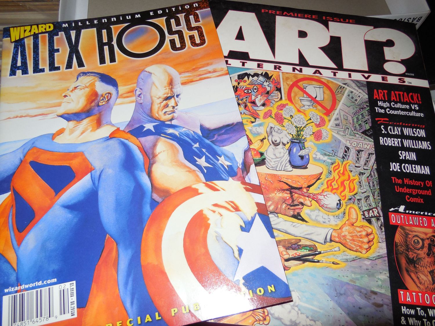
Seen below are the major inspirations for the painting, Alex Ross and Robert Williams.  I turned to Ross for technique, as he's one of the few artists I know who's not afraid to work with straight black, and because I wanted to experiment with his style of underpainting.  William, meanwhile, informed my sense of design and color choice.  Although they may seem like an odd pairing, when I got into it, I discovered they were more alike than you'd at first realize.  This is probably due to both having their roots firmly in the comic industry and bringing that perspective to their work.


The band sent me a fairly detailed description of what they wanted to see in this piece.  It was just up to me to tweak the design a bit, then execute it with detailed touches of my own.  My first step was actually to gather some photo reference for the piece and paste together a sort of digital collage, tweaking the elements until I got the composition I was looking for.

Working in Sketchbook Pro on my tablet PC, I turned that collage into a "pencil" drawing where I laid in some of the details I wanted to see in the finished piece.  This was roughed in color in Photoshop and sent to the band for approval and/or corrections.  There was only one critique to come from this; I had originally placed logos of other bands as stickers on the dashboard, intending them as a tribute to some of Brain Dead's musical influences.  They decided they didn't want them there, which makes sense in retrospect, as that might cause legal issues.  So even though I thought it would be a cool tribute, I removed them and later replaced them with parodied versions of L.A. area radio station logos.


Once the composition was nailed down, I chose my work surface for the finished painting.  A nice big (20 x 30") piece of cold press illustration board did the job.  It had a bit more tooth than I like on my boards, so I applied about half a dozen coats of gesso, with sanding in between.  When that was done, I had a nice bright, white, smooth surface on which to paint.  I blew up the color rough to size and had it printed in 11 x 17 sections that were taped together to make a full-sized print.  With this and a 6B pencil, the drawing was transferred to the board.

After each session at the drawing board, I will stand back for a few minutes and just study the piece to make sure I like the way it's working out.  After transferring the drawing, I decided that the composition seemed a little too stiff for my liking.  The solution was to change Billy's pose to something more dynamic.  I think this gave more energy and interest to the piece, while still maintaining the balance of the composition.


Once I was satisfied with the drawing once again, I started in on the underpainting.  This was done in two passes, one to just pick out the forms in black, with no concerns for shading at this point.


The second pass added grey tones that I hoped would show through in the final painting.  Alex Ross uses gouache for his color work, which is naturally more transparent, but I find that if I thin my acrylics enough and work quickly enough, I can achieve a satisfactory level of transparency as well.


Now I'm ready to start blocking in the color, starting with the background.  I'm pretty sloppy at this stage, as I'm not concerned about colors overlapping too much until I get into the detail work.  I've learned from studying the work of artists like Boris Vallejo that it can be a benefit to have some mingling of color to create subtlety in the finished work.

From that point, it's just a matter of laying down the color in several layers, working from "back to front" for the details.  The big challenge for me was to render the borealis behind Billy on the right, as this was something I had never attempted before.  I had actually rendered this in a completely different way before deciding I didn't like the results and painting over the whole area and starting again.


More detail work.  You can see that the thing is finally starting to come together.  Note the bands of black at both sides of the painting.  As this is for a CD cover, the painting had to be square, which meant that I had leftover space at each side of my board.  I coated these areas in black and tested out my borealis technique on them.  This leads to an interesting result later on.


Nearly there.  All the major colors are in place and most of the details picked out.  Here, I'm trying to work out things like light and shadow, plus tiny details like the photo CD's in the visors, and the faux radio station logos on the dashboard.


And done.  There's a few tweaks left to do once I have this thing scanned, but otherwise, it's complete.  There's still a few things I'm not entirely happy with, but I learned long ago that I'll never be completely happy with any piece of work, and there comes a time when you just have to put down the paintbrush and call it a day.  If I give in to the temptation to continue tweaking a piece, it will end up overworked and possibly just a big brown/grey mess.

You can also see now what I ended up doing with the empty space off to the sides.  I thought it would be fun to do quick, impressionist portraits of the band members (plus Billy!) from photos on their Facebook profiles.  These were executed in about 5 minutes each, using a square brush loaded with titanium white, with a bit of black to pull out some details.  I'm not much of a portraitist, but this was a quick bit of fun.

A closer look at the band portraits.


And, finally, the finished piece with all the digital work done and the band logo dropped in.  This is, more or less, how it will appear on the CD cover.  The sharp-eyed fans on Facebook seem to have been having fun picking out all the details and metal music references worked into the painting.  I won't spoil the fun by listing them all here, but there are quite a few in there.

This is one of the most fun pieces I've done in years, partly because of the subject matter, and partly because I really enjoyed getting back into acrylics to this depth.  It helps too that I actually enjoy Brain Dead's music (Indoctrinator was my soundtrack more than once while painting this) and the guys are great to work with.
While you're here (you are still here, right?) let me suggest you check out Brain Dead's music over at Bandcamp and on Facebook.  If you like your music on the heavy side, this will definitely please you.  These guys really bring the goods.  Watch for the new album, "Disaster Ahead" to drop there soon.


20 January 2015

Brain Dead: A Work in Process

Recently, I was hired to create a poster for an upcoming tour by the thrash bands Brain Dead and Madrost.  I thought it would be fun for me, and possibly instructional for some, to show the steps I took to making the final image for what turned out to be a kickass piece of work.  Enjoy.

Preparatory notes:  I have a little bit of history with Brain Dead, having designed the art for their demo CD and their first studio album, and had created a mascot of sorts for them that they wanted to use on the poster.  I had no direct contact with Madrost for this project, but they had a mascot of their own that needed to share prominent space on the poster.  The notes I was given for the poster indicated that they wanted something that showed the two main figures doing violent things to the audience at a thrash metal concert.  From that, I got the idea that they would be brutalizing the crowd, but that the crowd was loving it, kind of the way a good metal concert will tear up your eardrums (at the least!), but is more enjoyable the more it does so.  The band liked the idea, so off to the drawing board I went!

At this stage, I really just wanted to nail down the concept and composition of the piece and make sure the major elements got enough room.  I was also asked to leave some room at top and bottom for text placement, so I avoided putting any important details in those areas.
Just for a personal touch, I looked up some photos of the members of Brain Dead and sketched them into the drawing.  I may have hidden a small self-portrait in there as well, but I ain't telling!

As I've mentioned here before, most of my ink work these days is done on a tablet PC.  I met cartoonist Mark Oakley a few years ago and he let me play with his Toshiba Portege, and I've been a tablet convert ever since.  I'm currently working on a Fujitsu Lifebook T5010, and it's the best art tool I've ever bought.  If there ever comes a day I can't get a tablet PC with pressure sensitive pen input, I think I'll be lost.
For this, I scanned the pencils in pieces using a nifty little hand scanner I found a while ago, and stiched the whole thing together.  Then I opened the piece in Sketchbook Pro and a couple of my favorite custom brushes to ink the piece.
When I'm working on a project like this, I'm always aware of where my influences are coming from, and they're always coming from somewhere.  Working on a piece like this, the work of Derek Riggs on Iron Maiden's album covers can't help coming to mind, but I was also aware of bringing in a little influence from such odd characters as Drew Friedman and Robert Crumb.  That's the kind of odd paths my mind takes at times.  Plus, if you'll take a close look at those clouds in the background, you'll see I've been toying with the style of Nico De Lort a little; his work has just been blowing me away lately.
Clearly, I tightened things up a lot here, and I must confess to one little cheat:  the buildings on either side in the background were photographs that were corrected for perspective, then converted to black and white using the Threshold tool and Gaussian Blur filter in Photoshop.  It saved me some time and gave me the raw kind of look I wanted for those areas.


Here, the color work begins.  For this I switch over to Photoshop, and follow a very comic book style process.  My first task here is to do flat colors for the whole piece.  This lets me get the overall color scheme in place and figure out where I need to balance or adjust colors.
I knew that the bands were going to want to add some text at the bottom, so I made the crowd nearly monochrome to create a good contrasting background for anything they might drop in there.  You can see that I'm leaning towards primary colors here to give the final image more impact, with just enough variation to allow me to establish depth and make the central figures pop.


Next, I add another layer set to multiply and brush in some shadows using a bluish shade of grey.  I realize a lot of colorists use channels for this sort of thing, as using layers increases file size significantly, but I'm more comfortable using layers, and my PC has plenty of RAM, so if it ain't broke, don't fix it, right?
Somewhere in there, I added the "Brain Dead" logo (also my design) to the band mascot's hat.  In earlier images, the hat says "Thrash", but we've changed it for this version for a bit of brand recognition.
Now we finally start to get some depth to the figures, even the monochrome ones, and this thing is starting to come together.
On top of that, I add yet another layer set to Lighten, and add some highlights.  Using the extra layer like this lets me adjust the intensity of the highlights much easier than if I were to paint them right onto the flat color.
Now this thing's getting much more life, and getting much closer to done.  Time for a few special effects.


For this (nearly) final stage, I added three special effects, one of which is very subtle.  First, the glow from the stage lights was created using the lasso tool and a gradient fill on a layer set to Screen mode.  Then, I selected the area around the trailing edge of the discs the robot creature is throwing, did a "Copy/Merged" in Photoshop, pasted the copied area as a new layer and ran a Motion Blur filter on the layer to add a slight sense of motion to the discs. 
Finally, I pulled a little trick that's sort of the artistic equivalent of backwards masking in music.  I found a large, good quality scan of Bruegel's "The Triumph of Death" and pasted it over the background layers (everything except the figures).  This is very subtle, but it lends a little bit of texture to the background plus it lends a little symbolist depth to the whole piece.  It's probably difficult to see at all in the online version.  If you happen to see a good print of this, look in the lighted areas of the background, especially right around the spotlights, and you'll catch a bit of it.  This is not the first time I've used this technique, but in prior attempts it was a little more obvious.

As I did not have to add the text areas myself, I guess we're done now, right?  Wrong.
Since this was going to be printed up for offline distribution, I wanted to be sure the colors would register properly and that the printed product would look good, so I had a test print done locally before sending it off.  In so doing, I found out that the Brain Dead character was turning out WAY too pink, and that the red tones overall were just way off.  So, I took it back to Photoshop for some color adjustments and tried it again.
 NOW we're done!  This final version doesn't come across quite as vibrant online, but it prints a whole lot better.  This is the one that shipped off to the band to add the final text to promote their tour.
And here's the poster with all the added text.  If you're in L.A., keep an eye out for this thing around town, and be sure to check out Brain Dead and Madrost when they roll through in May!

16 December 2013

New Work Published: Indoctrinator by Brain Dead!

One of the things that made me want to get into the art business in the first place was the art on '80's rock albums.  Richard Corben blew my doors off with his cover for Meat Loaf's "Bat Out of Hell", and Derek Riggs made sure they stayed blown off with his art for the various Iron Maiden albums.  Ever since, I've been fascinated by the art and design of album covers, especially for the heavier styles of music, as they seem to have more fantastic elements.
I still have, somewhere in my sketch archives, a few of the pencil reproductions I've done of some of Derek Riggs's work,, as well as variations of pieces of art I've done for local bands like Urgent, Innocence and Marshal Law.  Somewhere in there, there's also a few pages for a very early comic book called "Warriors of the Metal World" that did fantasy/horror comic adaptations of heavy metal songs.  The less said about that the better.
All that is but preamble to tell you why I'm so proud to be part of this current project.  A while back, the thrash band "Brain Dead" invited me to design a piece of art for their demo CD and T-shirts.  This led to me designing their mascot, "Billy Brains" (no Iron Maiden influence there...nope, no sir), and later to the current project, the cover for their debut album "Indoctrinator".
I've been keeping the full version of this under wraps until the band was ready to release it themselves.  Now, as of midnight last night, they've released the art along with the first track from the album, "High Value Target".  The track, indeed the entire album was funded through a Kickstarter project to bring producer Bill Metoyer on board.  If you'll take a look at Bill's website, you'll see that his credentials read like a who's who of heavy metal.  With those kind of productions values and talent like Brain Dead's at the wheel, you know that "Indoctrinator" is going to one wild ride!
You can hear "High Value Target" right now over at ReverbNation.  Crank those speakers up and rock out with some of the best new metal tearing up the net.  And while you're there, be sure to check out the eye candy on that cover.
Thanks to Adam and Rez and all the rest of Brain Dead for inviting me to be part of this project, and I hope (wink wink) we get the chance to work together again.


Update:  The full album "Indoctrinator" has now been released.  You can find it at their BandCamp page or search it on iTunes.  Go get it now!