Hot off the drawing board is the latest album cover for L.A. thrash band Brain Dead. Once again, I get the pleasure of illustrating the adventures of Billy Brains for these guys. This one marks my fourth outing for their music, having done the label for their EP and the covers for Indoctrinator and their team-up with Six Pack of Doom.
Having rediscovered a taste for working in physical media lately, I wanted to do this one as a full-on painting, with as little computer work as possible. I thought it might be interesting to post some of my process for this piece, so I tried to remember to photograph the piece at each stage of progress. Click any of the images to see them at a larger size.
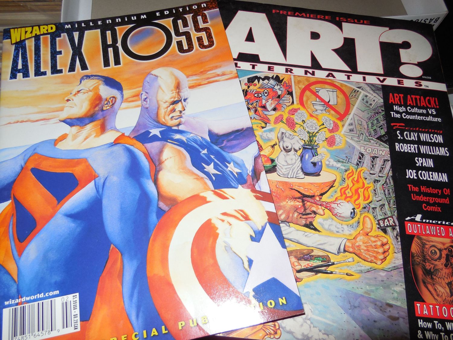
Seen below are the major inspirations for the painting, Alex Ross and Robert Williams. I turned to Ross for technique, as he's one of the few artists I know who's not afraid to work with straight black, and because I wanted to experiment with his style of underpainting. William, meanwhile, informed my sense of design and color choice. Although they may seem like an odd pairing, when I got into it, I discovered they were more alike than you'd at first realize. This is probably due to both having their roots firmly in the comic industry and bringing that perspective to their work.

The band sent me a fairly detailed description of what they wanted to see in this piece. It was just up to me to tweak the design a bit, then execute it with detailed touches of my own. My first step was actually to gather some photo reference for the piece and paste together a sort of digital collage, tweaking the elements until I got the composition I was looking for.
Working in Sketchbook Pro on my tablet PC, I turned that collage into a "pencil" drawing where I laid in some of the details I wanted to see in the finished piece. This was roughed in color in Photoshop and sent to the band for approval and/or corrections. There was only one critique to come from this; I had originally placed logos of other bands as stickers on the dashboard, intending them as a tribute to some of Brain Dead's musical influences. They decided they didn't want them there, which makes sense in retrospect, as that might cause legal issues. So even though I thought it would be a cool tribute, I removed them and later replaced them with parodied versions of L.A. area radio station logos.

Once the composition was nailed down, I chose my work surface for the finished painting. A nice big (20 x 30") piece of cold press illustration board did the job. It had a bit more tooth than I like on my boards, so I applied about half a dozen coats of gesso, with sanding in between. When that was done, I had a nice bright, white, smooth surface on which to paint. I blew up the color rough to size and had it printed in 11 x 17 sections that were taped together to make a full-sized print. With this and a 6B pencil, the drawing was transferred to the board.
After each session at the drawing board, I will stand back for a few minutes and just study the piece to make sure I like the way it's working out. After transferring the drawing, I decided that the composition seemed a little too stiff for my liking. The solution was to change Billy's pose to something more dynamic. I think this gave more energy and interest to the piece, while still maintaining the balance of the composition.
Once I was satisfied with the drawing once again, I started in on the underpainting. This was done in two passes, one to just pick out the forms in black, with no concerns for shading at this point.
The second pass added grey tones that I hoped would show through in the final painting. Alex Ross uses gouache for his color work, which is naturally more transparent, but I find that if I thin my acrylics enough and work quickly enough, I can achieve a satisfactory level of transparency as well.
Now I'm ready to start blocking in the color, starting with the background. I'm pretty sloppy at this stage, as I'm not concerned about colors overlapping too much until I get into the detail work. I've learned from studying the work of artists like Boris Vallejo that it can be a benefit to have some mingling of color to create subtlety in the finished work.
From that point, it's just a matter of laying down the color in several layers, working from "back to front" for the details. The big challenge for me was to render the borealis behind Billy on the right, as this was something I had never attempted before. I had actually rendered this in a completely different way before deciding I didn't like the results and painting over the whole area and starting again.
More detail work. You can see that the thing is finally starting to come together. Note the bands of black at both sides of the painting. As this is for a CD cover, the painting had to be square, which meant that I had leftover space at each side of my board. I coated these areas in black and tested out my borealis technique on them. This leads to an interesting result later on.
Nearly there. All the major colors are in place and most of the details picked out. Here, I'm trying to work out things like light and shadow, plus tiny details like the photo CD's in the visors, and the faux radio station logos on the dashboard.
And done. There's a few tweaks left to do once I have this thing scanned, but otherwise, it's complete. There's still a few things I'm not entirely happy with, but I learned long ago that I'll never be completely happy with any piece of work, and there comes a time when you just have to put down the paintbrush and call it a day. If I give in to the temptation to continue tweaking a piece, it will end up overworked and possibly just a big brown/grey mess.
You can also see now what I ended up doing with the empty space off to the sides. I thought it would be fun to do quick, impressionist portraits of the band members (plus Billy!) from photos on their Facebook profiles. These were executed in about 5 minutes each, using a square brush loaded with titanium white, with a bit of black to pull out some details. I'm not much of a portraitist, but this was a quick bit of fun.
A closer look at the band portraits.
And, finally, the finished piece with all the digital work done and the band logo dropped in. This is, more or less, how it will appear on the CD cover. The sharp-eyed fans on Facebook seem to have been having fun picking out all the details and metal music references worked into the painting. I won't spoil the fun by listing them all here, but there are quite a few in there.
This is one of the most fun pieces I've done in years, partly because of the subject matter, and partly because I really enjoyed getting back into acrylics to this depth. It helps too that I actually enjoy Brain Dead's music (Indoctrinator was my soundtrack more than once while painting this) and the guys are great to work with.
While you're here (you are still here, right?) let me suggest you check out Brain Dead's music over at
Bandcamp and on
Facebook. If you like your music on the heavy side, this will definitely please you. These guys really bring the goods. Watch for the new album, "Disaster Ahead" to drop there soon.